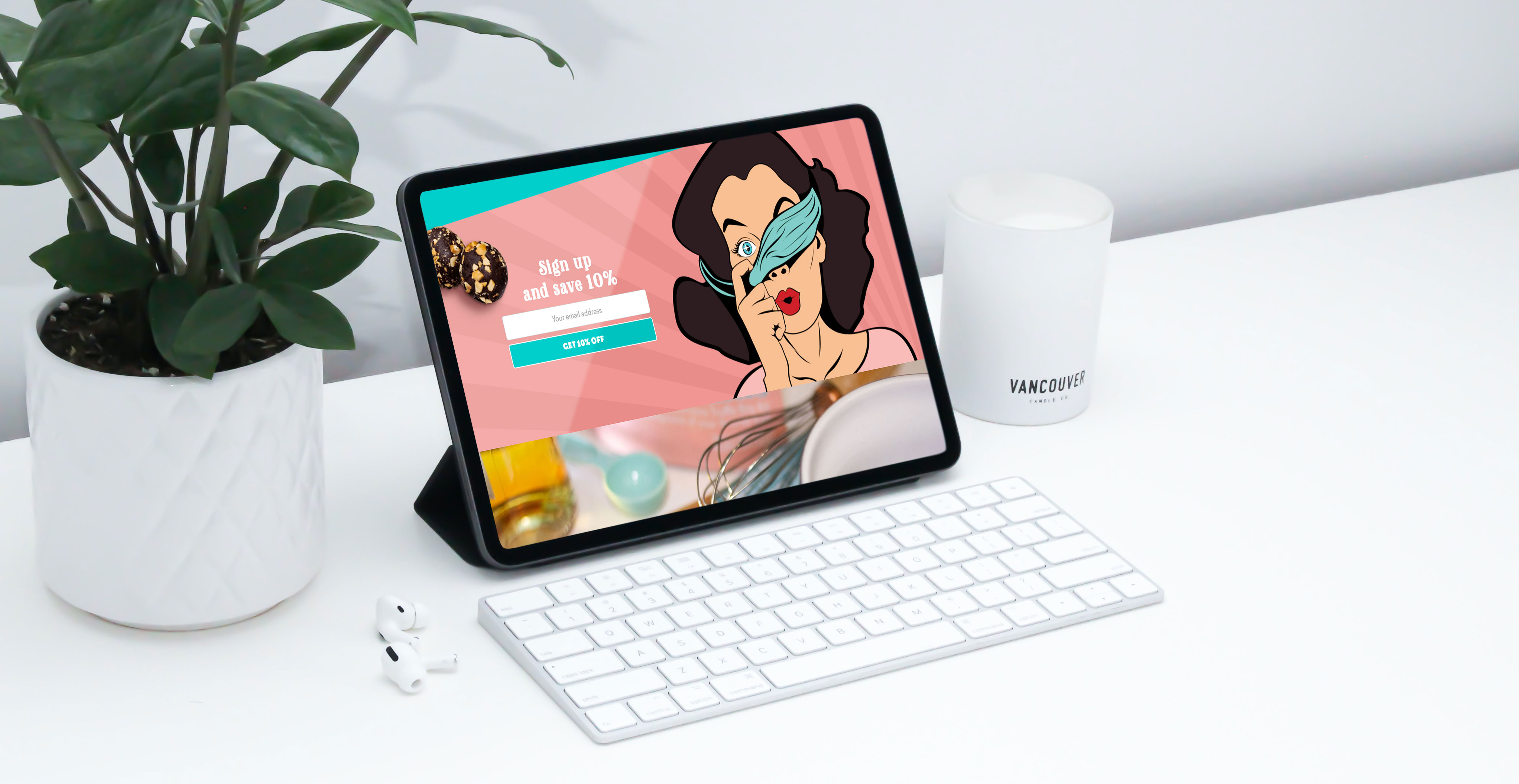
Overview
LiqHer Balls has an incredible product, but their website was built on a GoDaddy template, which didn't do justice to their incredible brand. The use of a basic theme failed to convey the uniqueness of their chocolaty and boozy desserts.
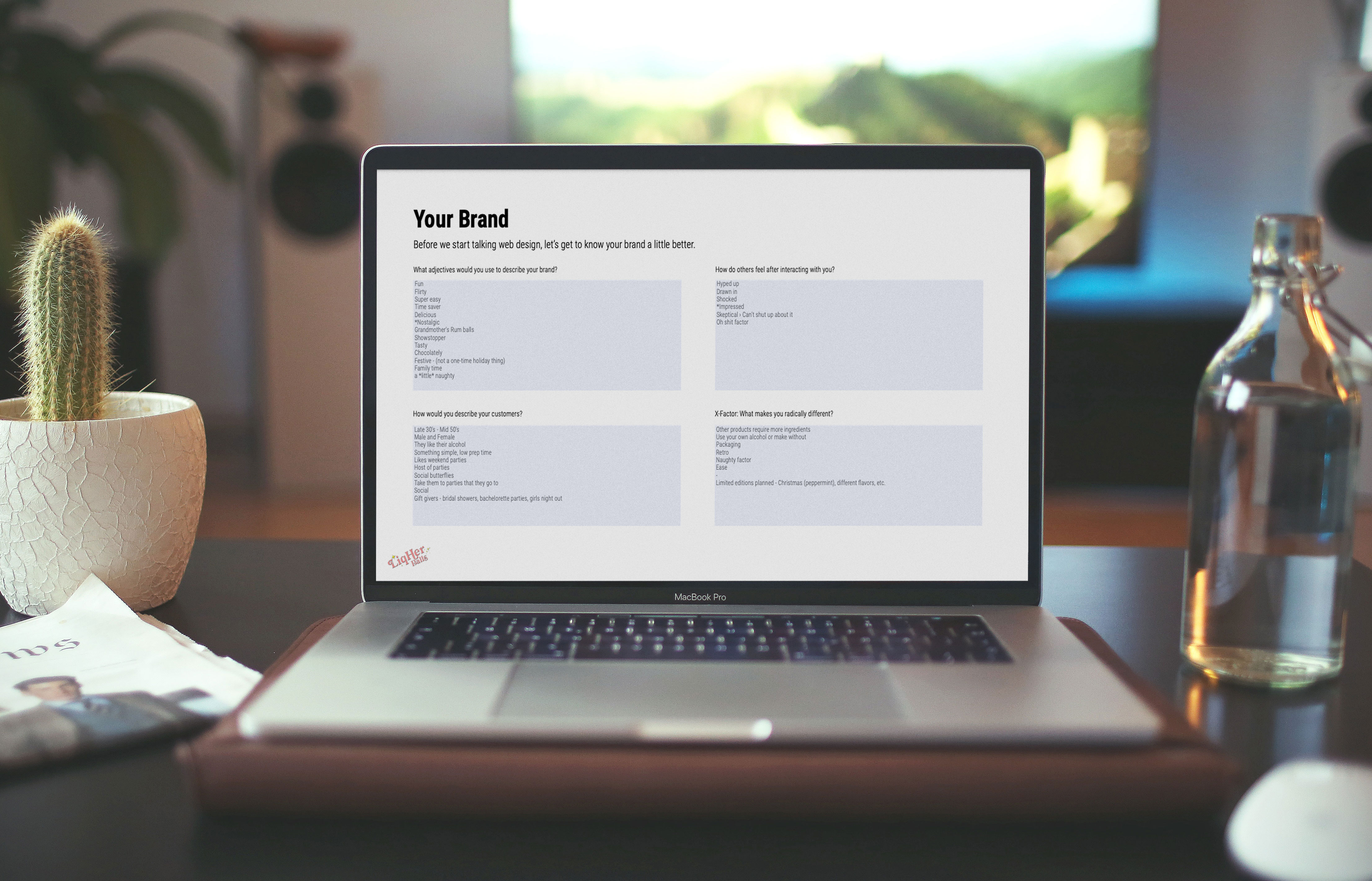
To kick things off, we started with a simple discovery and brand attributes exercise to provide direction for all our creative work moving forward.
Once a solid understanding of the LiqHer Balls brand was established, we worked on creating some custom stylescapes before mocking up the homepage. These helped establish the look and feel of the website before moving forward.
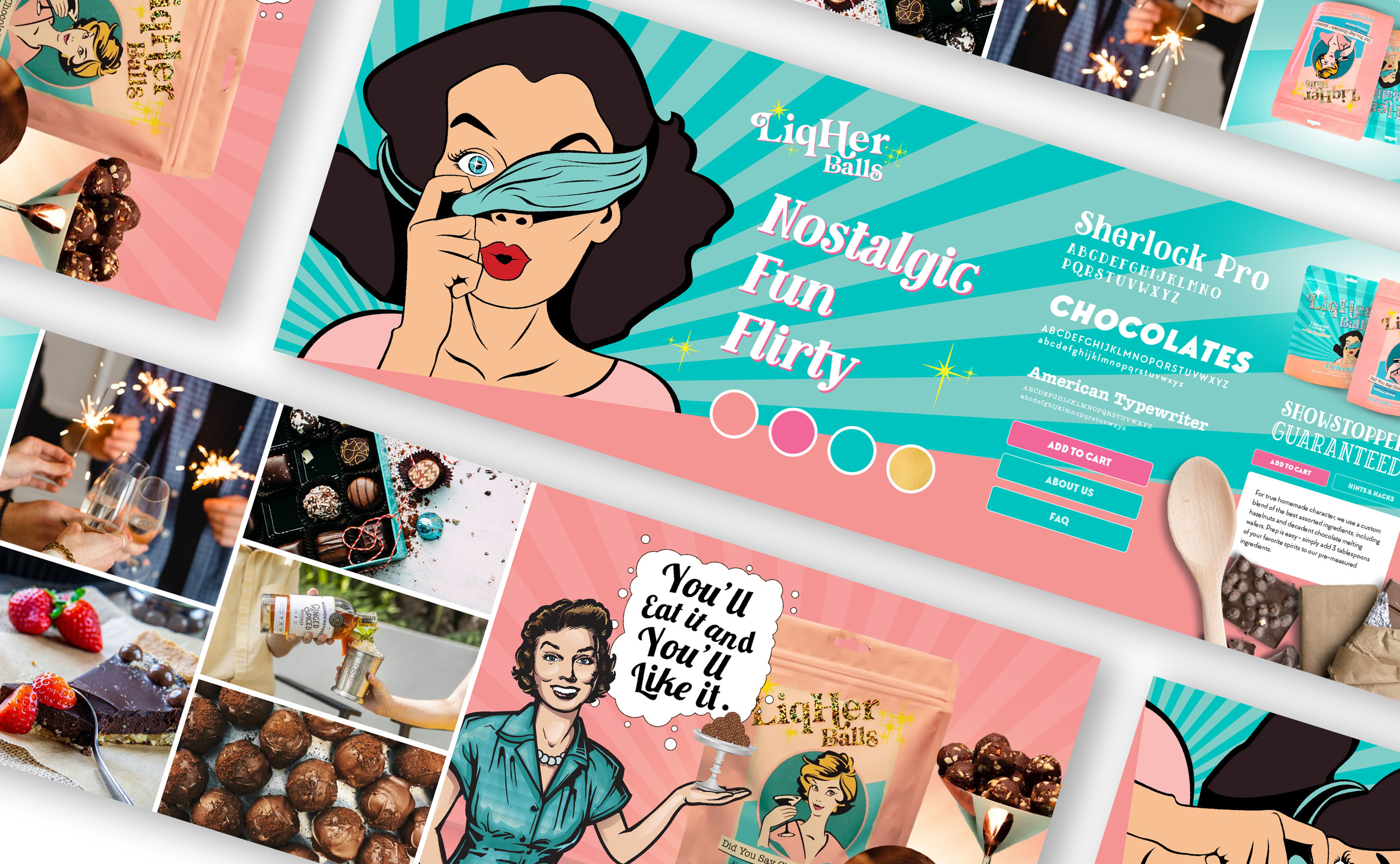
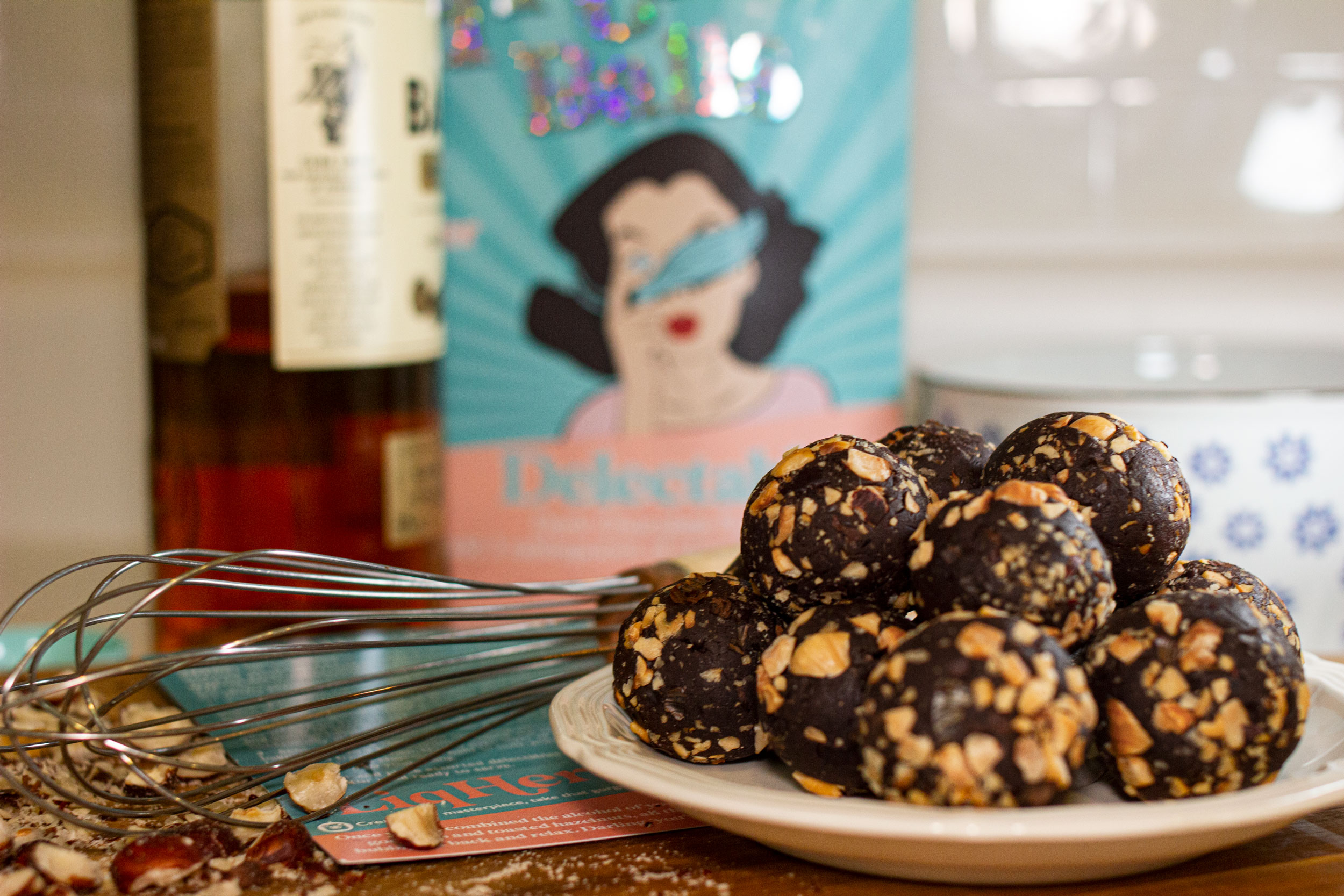
In addition to establishing the look and feel of the brand's new website, we also captured some custom lifestyle photography to better showcase the product in context.

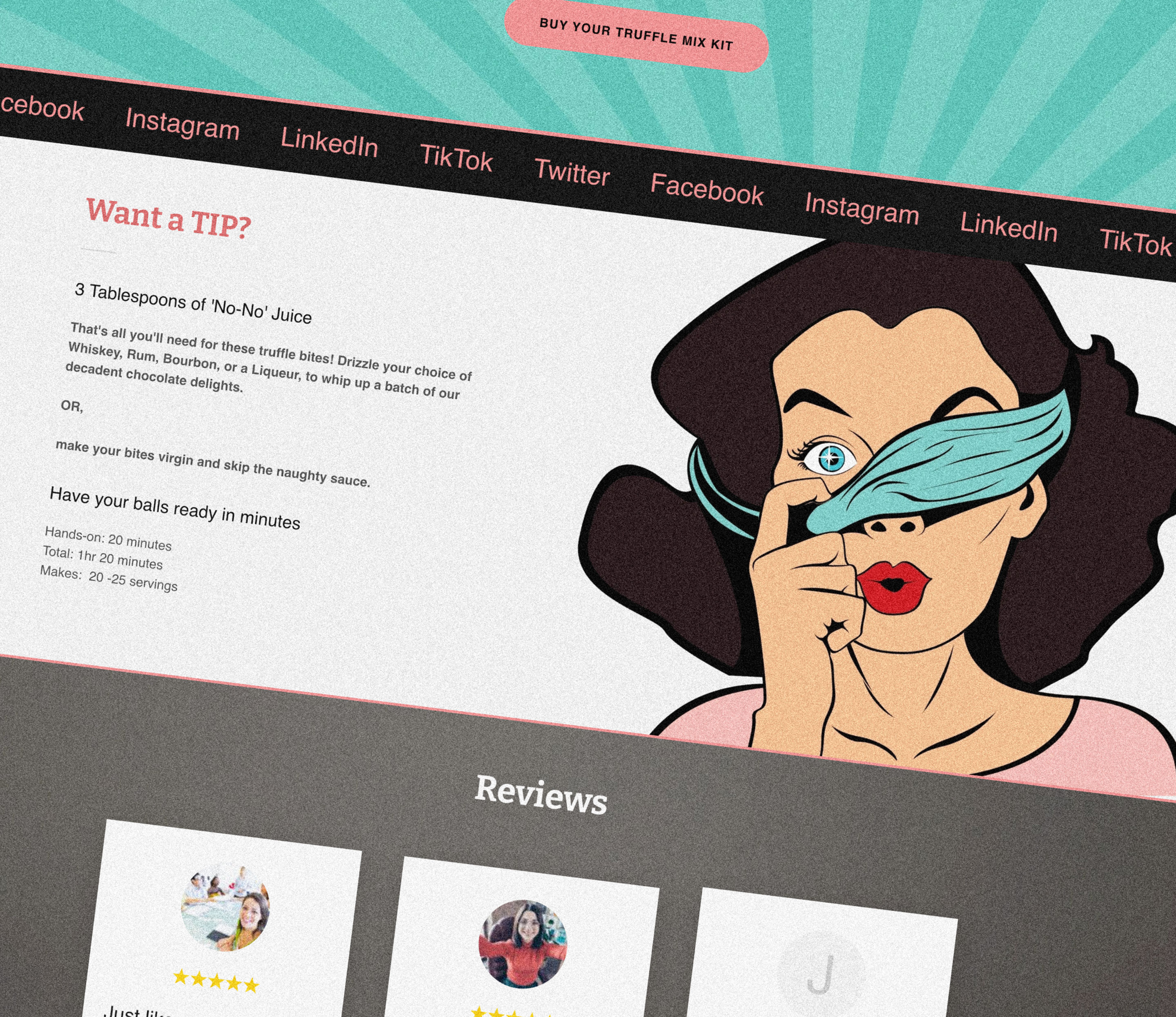
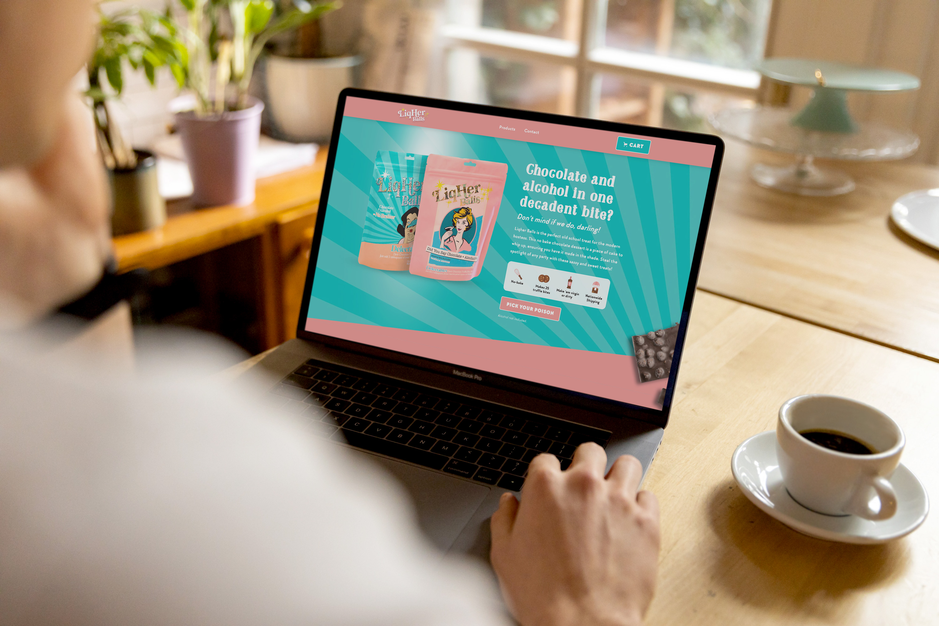
The new LiqHer Balls website was designed in Figma and developed in Webflow, then exported to Shopify so that the owners can manage their products and settings from their Shopify account. The new custom website now effectively showcases their brand as fun, upbeat, and full of personality.

David's natural talent and keen eye make for an elegant, seamless, and logical experience for the user. He's my go-to for all UI/UX projects.


David has a high degree of professionalism, quality of work, and timeliness. We'll definitely be reaching out when we need more Webflow work.


David is reliable, honest, and a downright pleasure to work with. He is also an amazing problem solver and has never failed to implement the features we've required.


