Adventurous Stills
Responsive web design for Arizona-based distillery
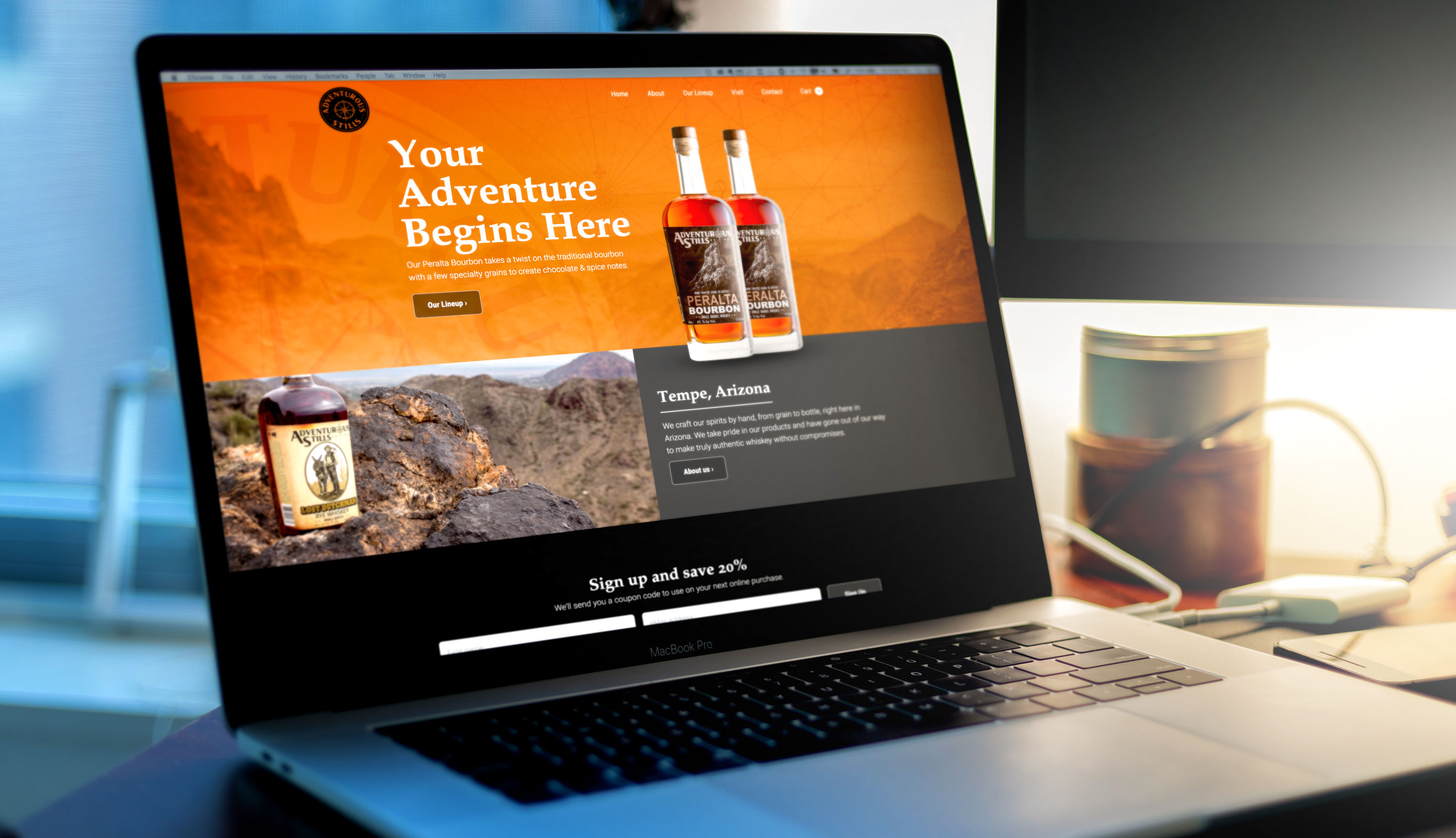
Overview
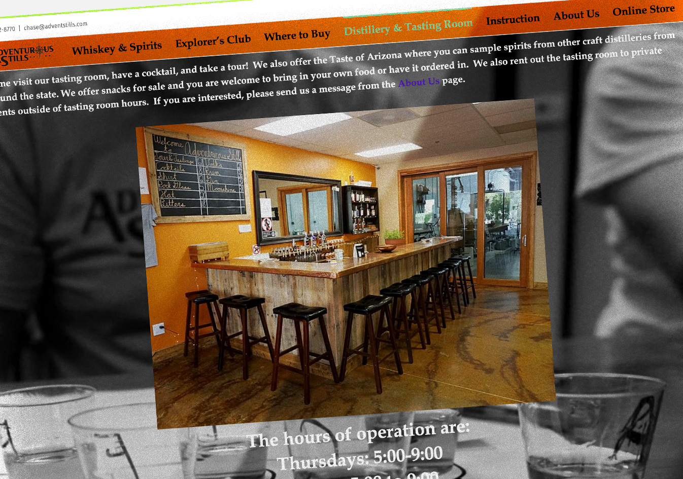
Adventurous Stills lacked a custom-tailored site to call their own. Their landing page was mostly unstyled, hard to view on mobile devices, and was difficult to navigate.
Unfortunately, a frustrating online experience (or lack thereof) may diminish trust in a company’s brand or in their product, even if that happens subconsciously. That’s certainly not fair to their amazing Whiskey.
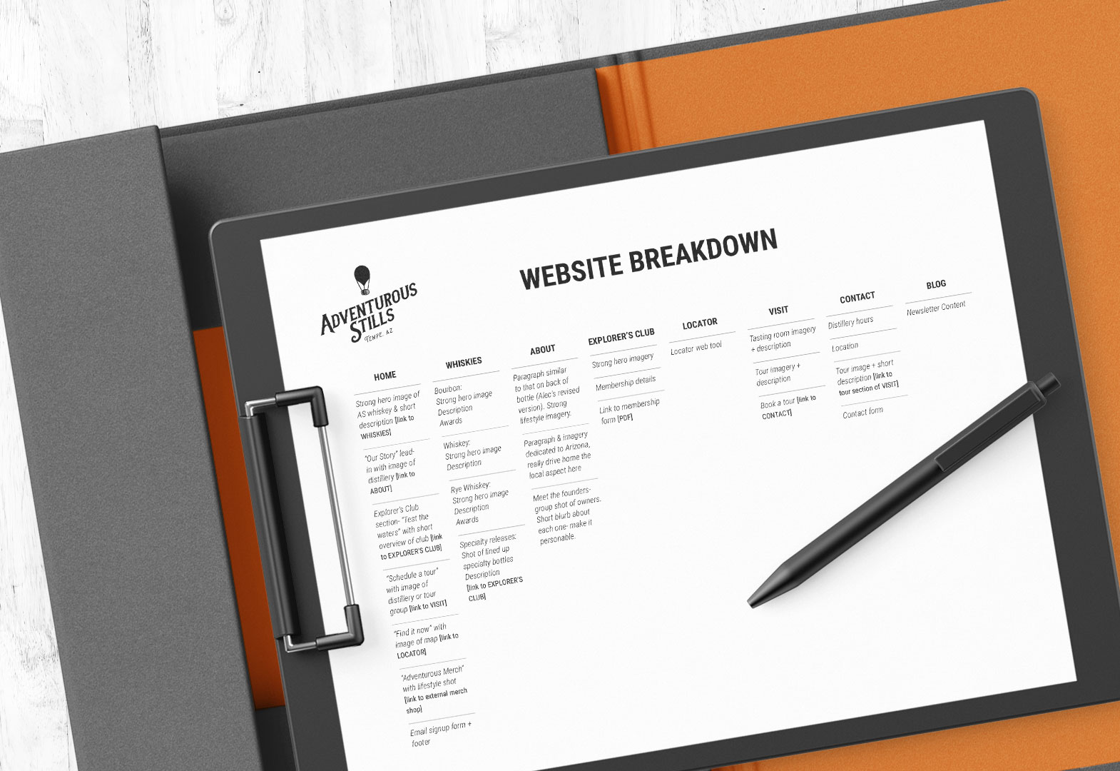
Similar to building a house, crafting a great website means starting with a good foundation: understanding goals and careful planning.
Some designers skip this stage and jump to the more exciting part, which is a surefire way to botch any project.
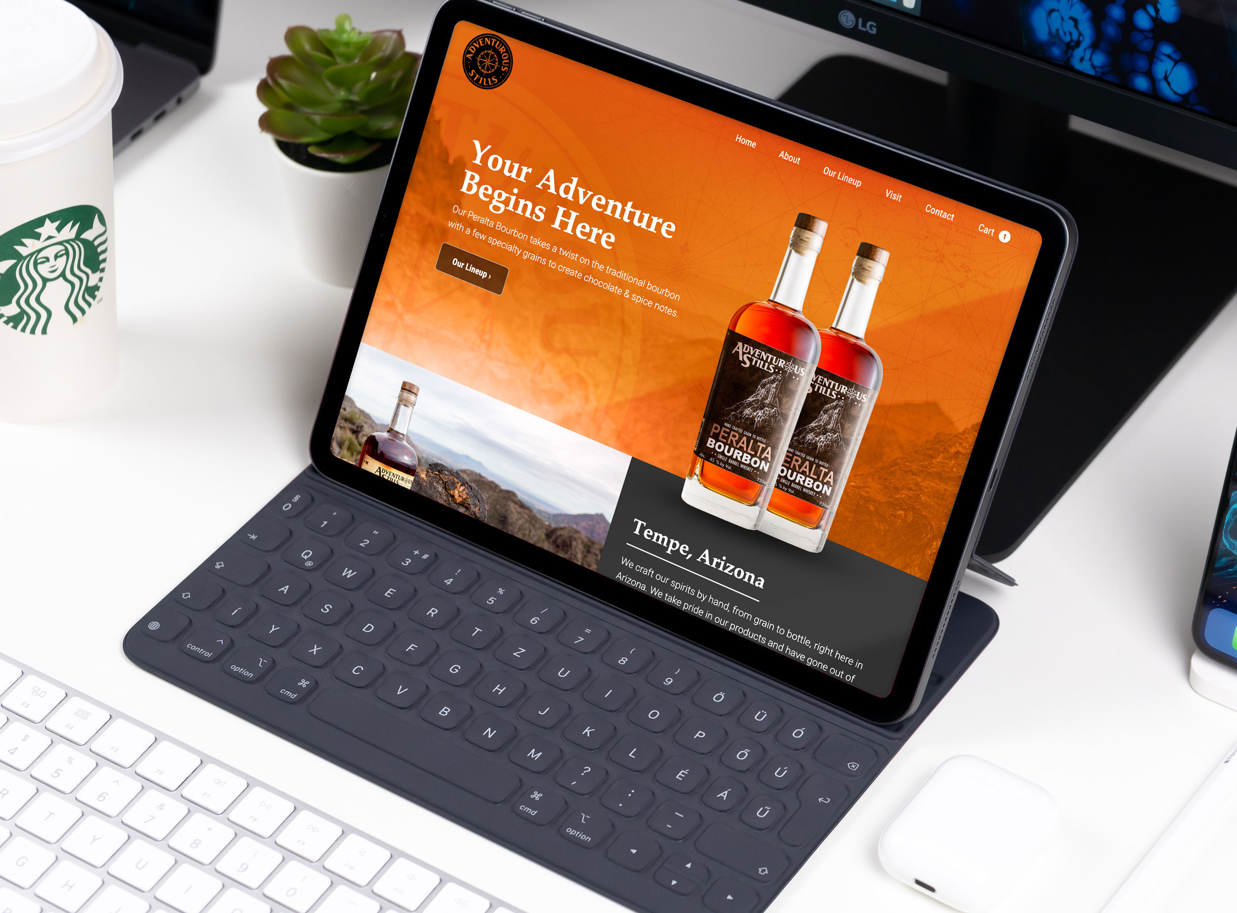
With the foundation securely in place, the next step was to craft a clean, intuitive site that looked beautiful on any device.
Additional customizations specific to the distillery included an age gate, a product finder, and email integration with Mailchimp to welcome new members and allow them to save on their first purchase.
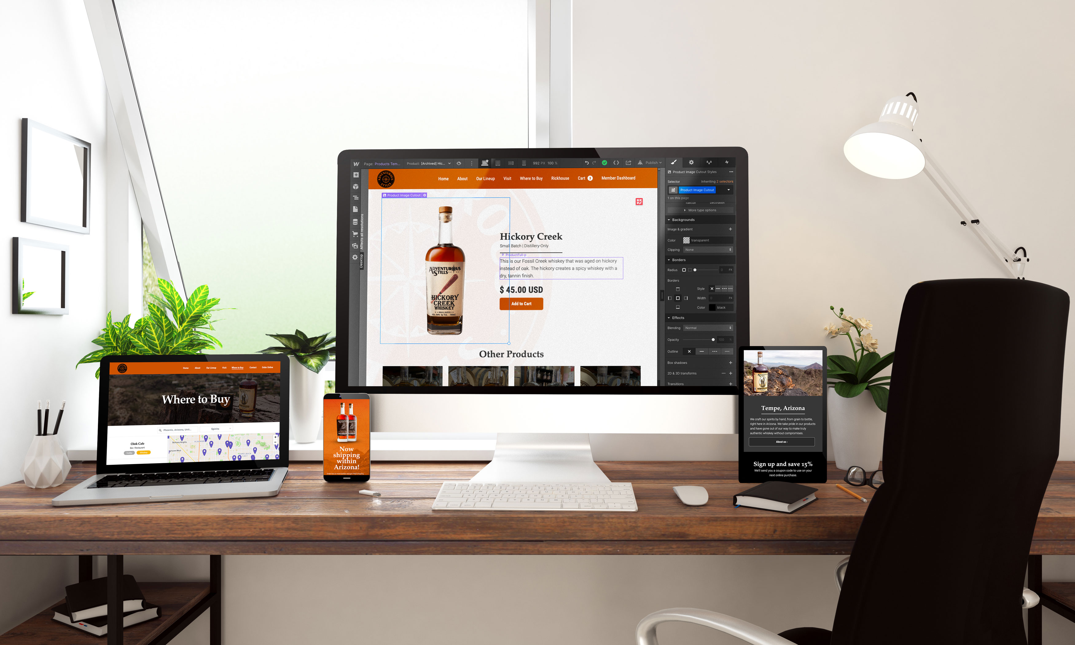

Adventurous Stills was delighted to have a customized site to call their own, claiming that the process helped bring their site from the “20th to the 21st century,” and reestablish some online credibility.
Using an intuitive client editor also allowed them to keep their site up-to-date without worrying about updating plugins or keeping up with any additional software.
Happy client, happy users.

David's natural talent and keen eye make for an elegant, seamless, and logical experience for the user. He's my go-to for all UI/UX projects.


David has a high degree of professionalism, quality of work, and timeliness. We'll definitely be reaching out when we need more Webflow work.


David is reliable, honest, and a downright pleasure to work with. He is also an amazing problem solver and has never failed to implement the features we've required.


